Angular Material is a great tool for creating intuitive, responsive and visually appealing user interfaces. It offers pre-built, reusable UI components that adhere to Google’s Material Design guidelines.
Since version 18, Angular has fully supported Material 3, which is based on design tokens implemented as CSS custom properties. This approach allows you to define custom properties at the highest level and have them cascade to the components that rely on them. With this update, you can granularly override style properties without increasing CSS selector specificity or targeting internal selectors of Angular Material components.
Version 19 introduced a new API to its powerful theming system, which allows developers to customize the look and feel of applications. It provides a structured approach to defining colors, typography and component styles, ensuring consistency across your app while maintaining flexibility for branding and design preferences.
At first glance it may seem confusing so let’s break it down. This article will guide you through the fundamentals of Angular Material theming, exploring how to create, configure, and apply custom themes. Let’s dive in!
Prerequisite: Sass fundamentals
Sass is a powerful CSS preprocessor that extends the capabilities of standard CSS, enabling developers to write cleaner, more modular, and maintainable styles. Angular Material uses Sass under the hood so it’s important to quickly define basic concepts.
Nesting
Sass nesting system allows to write CSS rules in a hierarchical and intuitive way that mirrors the structure of HTML. Instead of repeatedly writing selectors, you can nest child styles directly inside their parent’s block.
Docs: https://sass-lang.com/documentation/style-rules/declarations/#nesting
.header {
  width: 100vw;

  &__logo {
    margin-left: auto;
  }

  &--dark {
    background-color: #3a2125;
    color: white;
  }

  h1 {
    font-size: 2rem;
    line-height: 2.8rem;

    &:hover {
      text-decoration: underline;
    }
  }
}
Variables
Simplify the management of your stylesheets by storing values like colors, spacing, size and other design elements in reusable, named variables.
Docs: https://sass-lang.com/documentation/variables/
$my-color: #12ea8c;
$selector: primary;

.card {
  $main-color: $my-color;
  background-color: $main-color;
  padding: 1rem;
}

// #{$variable} - string interpolation
.link-#{selector} {
  color: $my-color;
}
Maps
Map allows you to store and manage data as key-value pairs. Similar to objects in JavaScript, map enables you to organize values in a structured and maintainable way.
Docs: https://sass-lang.com/documentation/values/maps/
$sizes: (
  sm: 10rem;
  md: 15rem;
  lg: 20rem;
  xl: 25rem;
);

@each $key, $value in $sizes {
  .card--#{$key} {
    width: $value;
  }
}

.user-card {
  width: map-get($sizes, md);
}
Lists
Lists are meant to group multiple values into simple data structures. SCSS lists are flexible and can be either comma-separated (1px, 2px, 3px) or space-separated (1px 2px 3px).
Docs: https://sass-lang.com/documentation/values/lists/
$size-prefixes: sm, md, lg;

.panel-#{nth($size-prefixes,2)} {
  color: $primary-color;
  width: 15rem;
}
Functions
Using functions you can perform operations and return values directly in a stylesheet. They enable dynamic styling by processing data as colors, numbers, strings, units and data structures like map and list. They support core concepts like boolean logic and loops.
Docs: https://sass-lang.com/documentation/values/functions/
@function fade-out($color, $alpha: 0.5) {
  @if $alpha < 0 or $alpha > 1 {
    @error “Provide value between 0 and 1”;
  }

  @return rgba($color, $alpha);
}

@function sum($numbers...) {
  $sum: 0;
  @each $number in $numbers {
    $sum: $sum + $number;
  }
  @return $sum;
}

.card {
  background-color: fade-out($primary-color);
  border: solid 1px fade-out($accent-color, 0.3);
  width: sum(50px, $base-width, 10vw);
}
Mixins
Mixin is a reusable block of CSS which you can define once and apply it wherever needed, reducing redundancy and making your code more maintainable. Mixins are especially useful for handling reusable patterns, complex property combinations, or cross-browser compatibility, as they can accept parameters to customize their behavior.
Docs: https://sass-lang.com/documentation/values/mixins/
@mixin reset-list {
  margin: 0;
  padding: 0;
  list-style: none;
}

@mixin horizontal-list($primary-element-color: currentColor) {
  @include reset-list;
  display: flex;
  gap: 1rem;

  li.primary {
    color: $primary-element-color;
  }
}
Modules
Modules help organize and manage styles more effectively, especially in larger projects. Two key directives, @import and @use, allow you to include styles from other files, but they differ in functionality and usage.
The older directive, @import, lets you include styles from one file into another. However, it has limitations, such as slower compilation and potential issues with duplicated styles (Sass code is executed with every @import statement).
Docs: https://sass-lang.com/documentation/at-rules/import/
Introduced as a modern replacement, @use provides a better way to import styles with namespacing. It avoids conflicts by requiring explicit references to imported variables or mixins.
Docs: https://sass-lang.com/documentation/at-rules/use/
@import “./variables.scss”;
@use “./functions.scss”;
@use “./my-awesome-mixins.scss” as mixins;

.options-list {
  @include mixins.horizontal-list(functions.fade-out($primary-color));
}
Defining custom theme
The new Angular Material API makes theming a lot easier. To enjoy the basic theme, the only thing you need to do is include the theme mixin in HTML-scoped styles to ensure it’s applied across the entire application. It accepts a map defining color, typography, and density, and outputs a set of CSS variables that control components’ appearance and layout.
@use “@angular/material” as mat;

html {
  @include mat.theme(
    (
      color: mat.$violet-palette,
      typography: Roboto,
      density: 0,
    )
  );
}
Of course, the possibilities for customization are much greater. First, let’s explore what additional features the theme mixin offers.
Colors
The theme‘s color determines the component color styles, such as the fill color of checkboxes and icons or outline color of inputs. Angular Material recognizes following color roles:
- Primary – it’s a main brand color being used for most prominent components across the UI. Angular Material uses a „base” primary color and several tonal variations like lighter and darker shades. Examples: buttons, active elements
- Secondary (accent) – color for highlighting or emphasizing elements. It’s often vibrant and contrasting to the primary color and used sparingly to avoid overwhelming the user. Examples: FAB button, active tab indicator
- Tertiary – role for contrasting accents that balance primary and secondary colors or bring heightened attention to an element such as an input field
- Warn – to communicate error states, such as an incorrect password entered into a text field
Each role is described by color palette – a set of similar colors with different hues ranging from dark (lowest index) to light (highest index). The Angular Material theme uses color palettes to create a color scheme to communicate an application’s hierarchy, state, and brand.
To compose your theme you can use one of prebuilt colors palettes: red, green, blue, yellow, cyan, magenta, orange, chartreuse, spring-green, azure, violet, rose. To get access to one, use a variable with the name “${{palleteName}}-pallete” from @angular/material.
If you need a colors that really match your brand you can create your own palette using this generator:
ng generate @angular/material:theme-colorNow you can configure colors using generated primary palette:
@use “@angular/material” as mat;
@use “./theme-colors” as theme;

html {
  @include mat.theme(
    (
      color: theme.$primary-palette,
      typography: Roboto,
      density: 0,
    )
  );
}
or configure tertiary color palette separately to add distinct accent color to some components:
@use “@angular/material” as mat;
@use “./theme-colors” as theme;

html {
  @include mat.theme(
    (
      color: (
        primary: theme.$primary-palette,
        tertiary: theme.$tertiary-palette
      ),
      typography: Roboto,
      density: 0,
    )
  );
}
Typography
Typography is a system that defines a set of font styles to ensure consistent and visually appealing text throughout an application. Here you can go a simple way, just defining font family:
@use “@angular/material” as mat;
@use “./theme-colors” as theme;

html {
  @include mat.theme(
    (
      color: theme.$primary-palette,
      typography: Poppins,
      density: 0,
    )
  );
}
or distinct font families for plain text (used for most of the application’s text) and brand text (used for headings and titles):
@use “@angular/material” as mat;
@use “./theme-colors” as theme;

html {
  @include mat.theme(
    (
      color: theme.$primary-palette,
      typography: (
        plain-family: Poppins,
        brand-family: Montserrat,
      ),
      density: 0,
    )
  );
}
If you’re looking for quality fonts, visit Google Fonts, where you can explore a wide selection with helpful preview tools. Select the fonts you need and embed the generated code for fetching them within the <head> tag of your index.html file.
Another configurable aspect of typography is font weight, allowing you to define specific weights for regular, medium, and bold text:
@use “@angular/material” as mat;
@use “./theme-colors” as theme;

html {
  @include mat.theme(
    (
      color: theme.$primary-palette,
      typography: (
        plain-family: Poppins,
        brand-family: Montserrat,
        bold-weight: 800,
        medium-weight: 500,
        regular-weight: 300,
      ),
      density: 0,
    )
  );
}
Density
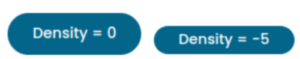
The density value determines the spacing within components, such as the padding around a button’s text or the height of form fields.
It accepts integers from 0 to -5, where 0 represents the default spacing and -5 provides the most dense and compact layout. Each step down (-1, -2, and so on) reduces the affected sizes by 4px, down to the minimum size required for components to render coherently, causing most of them to include less whitespace in their layout.
@use “@angular/material” as mat;
@use “./theme-colors” as theme;

html {
  @include mat.theme(
    (
      color: theme.$primary-palette,
      typography: Poppins,
      density: -5,
    )
  );
}
Context-specific theme
You don’t need to restrict your application to a single theme. If you want to make a specific section stand out and capture attention, you can apply a different theme to that section.
@use “@angular/material” as mat;
@use “./theme-colors” as theme;

html {
  @include mat.theme(
    (
      color: theme.$primary-palette,
      typography: Poppins,
      density: 0,
    )
  );
}

.azure-section {
  @include mat.theme(
    (
      color: mat.$azure-palette,
      typography: Poppins,
      density: 0,
    )
  );
}
Dark mode
Dark mode is a widely used feature, and Angular Material simplifies its implementation. By default, it uses the light-dark function, which allows you to specify two colors for a property. This function returns one of the two colors based on whether a light or dark color scheme is active. The scheme is determined by either the developer’s configuration or the user’s preference set through the operating system or browser settings.
Additionally, the color-scheme CSS property provides the ability to override a user’s color scheme to light or dark. This flexibility makes it easy to create visually consistent and user-friendly interfaces.
@use “@angular/material” as mat;
@use “./theme-colors” as theme;

@mixin apply-dark-mode {
  color-scheme: dark;
}

html {
  @include mat.theme(
    (
      color: theme.$primary-palette,
      typography: Poppins,
      density: -2,
    )
  );
}

body {
  margin: 0;

  &.dark-mode {
    @include apply-dark-mode;
  }
}
With these defined styles, you can implement a toggle to switch between light and dark modes by dynamically adding or removing the dark-mode class from the <body> element. To ensure the best user experience, the initial mode should align with the user’s device settings.
export type ColorMode = 'light' | 'dark';

export const PREFERRED_COLOR_MODE = new InjectionToken<Signal<ColorMode>>(
  'PREFERRED_COLOR_MODE',
  {
    providedIn: 'root',
    factory: () => {
      const destroyRef = inject(DestroyRef);
      const mediaQuery = window.matchMedia('(prefers-color-scheme: dark)');

      const colorMode = signal<ColorMode>(
        mediaQuery.matches ? 'dark' : 'light',
      );

      const preferredColorModeChangeListener = (event: MediaQueryListEvent): void => {
        event.matches ? colorMode.set('dark') : colorMode.set('light');
      };

      mediaQuery.addEventListener('change', preferredColorModeChangeListener);

      destroyRef.onDestroy(() =>
        mediaQuery.removeEventListener('change', colorSchemeChangeListener),
      );

      return colorMode;
    },
  },
);

// Renderer2 cannot be directly injected into singleton service
export const injectRenderer2 = (): Renderer2 =>
  inject(RendererFactory2).createRenderer(null, null);

@Injectable({ providedIn: 'root' })
export class DarkModeService {
  private readonly DARK_MODE_CLASS = 'dark-mode';

  private readonly _renderer = injectRenderer2();
  private readonly _document = inject(DOCUMENT);
  private readonly _preferredColorMode = inject(PREFERRED_COLOR_MODE);

  private readonly _mode = linkedSignal(() => this._preferredColorMode());
  readonly mode = this._mode.asReadonly();
  readonly isDarkMode = computed(() => this.mode() === 'dark');

  constructor() {
    effect(() => {
      this._applyDarkModeClass(this.isDarkMode());
    });
  }

  toggleDarkMode(): void {
    this._mode.update((mode) => (mode === 'light' ? 'dark' : 'light'));
  }

  setDarkMode(enabled: boolean): void {
    this._mode.set(enabled ? 'dark' : 'light');
  }

  private _applyDarkModeClass(enabled: boolean): void {
    if (enabled) {
      this._renderer.addClass(this._document.body, this.DARK_MODE_CLASS);
    } else {
      this._renderer.removeClass(this._document.body, this.DARK_MODE_CLASS);
    }
  }
}
If you prefer not to rely on Angular Material’s default color choices for dark mode, you can create separate themes by defining the theme-type property in the color map and applying them as needed.
@use “@angular/material” as mat;
@use “./light-theme” as light-theme;
@use “./dark-theme” as dark-theme;

@mixin apply-light-theme {
  @include mat.theme(
    (
      color: (
        primary: light-theme.$primary-palette,
        tertiary: light-theme.$tertiary-palette,
        theme-type: light
      ),
      typography: Poppins,
      density: 0,
    )
  );
}

@mixin apply-dark-theme {
  @include mat.theme(
    (
      color: (
        primary: dark-theme.$primary-palette,
        tertiary: dark-theme.$tertiary-palette,
        theme-type: dark
      ),
      typography: Poppins,
      density: 0,
    )
  );
}
System variables
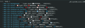
As mentioned earlier, the Material 3 implementation relies on design tokens, implemented as CSS custom properties, to provide highly granular and flexible styling. The theme mixin generates a significant number of tokens. You can inspect them by opening your browser’s developer tools and examining the root selectors. To make them more distinguishable, all start with the prefix “mat-sys”. Let’s briefly describe them.
Colors
Theme mixin produces quite a few tokens for colors like:
- –mat-sys-primary as most commonly used color by components
- –mat-sys-surface as low-emphasis background color
- –mat-sys-error to alert the user
- -mat-sys-outline for borders and dividers
- several variants of alternative colors
- a few shades of background surface
You can look through them in documentation. The general rule of thumb is to apply your chosen color to the element and use the corresponding “mat-sys-on” token for text, icons and other visual elements to ensure proper accessibility and legibility. For example: primary button uses –mat-sys-primary as background color and –mat-sys-on-primary as label color.
Typography
There are five categories of font types defined by Material Design:
- Body – These styles are used for longer passages of text. Avoid expressive or decorative fonts for body text, as they can be harder to read at smaller sizes
- Display – As the largest text on the screen, display styles are reserved for short, important text or numerals, particularly on large screens. For display text, consider using a more expressive font, such as handwritten or script styles
- Headline – Best suited for short, high-emphasis text on smaller screens, headline styles are ideal for marking primary passages of text or key regions of content.
- Label – Label styles are smaller and utilitarian, used for text inside components or very small text in the content body, such as captions. For example, buttons typically use the label large style
- Title – Smaller than headline styles, title styles are used for medium-emphasis text that is relatively short. These are ideal for dividing secondary passages of text or secondary regions of content
Each font category includes three sizes: small, medium, and large.This results in a total of 15 font configurations, which can be accessed using the token “–mat-sys-{{category}}-{{size}}”. Additionally, specific parts of the font definition can be accessed individually by appending suffixes such as: “font”, “line-height”, “size”, “tracking” or “weight”.
--mat-sys-body-medium: 400 0.875rem / 1.25rem Roboto, sans-serif;
--mat-sys-body-medium-font: Roboto, sans-serif;
--mat-sys-body-medium-line-height: 1.25rem;
--mat-sys-body-medium-size: 0.875rem;
--mat-sys-body-medium-tracking: 0.016rem;
--mat-sys-body-medium-weight: 400;
Elevation
Elevation is supposed to provide a sense of depth and organize elements on interface:
- allow surfaces to move in front of and behind other surfaces
- reflect spatial relationships
- focus attention on the highest elevation
So far you could introduce elevation using the “mat-elevation-z” class. The new implementation defines six elevation levels as tokens from –mat-sys-level0 to –mat-sys-level5 defined as CSS box-shadow styles.
Using system variables
If you’re familiar with CSS custom properties, you know how simple and flexible they are to use. You can apply them anywhere in your layout to build and customize your design effortlessly.
body {
  background-color: var(--mat-sys-surface);
  color: var(--mat-sys-on-surface);
}

h1 {
  font: var(--mat-sys-headline-large);
}

h2 {
  font: var(--mat-sys-headline-medium);
}
Customizing tokens
Angular Material components support narrowly targeted customization of specific tokens through the overrides mixins. This allows for precise adjustments to system-level theme CSS variables as well as individual component tokens.
This API ensures that customized tokens are correctly spelled, providing validation and helping maintain backward compatibility if tokens are added, moved, or renamed in future Angular Material versions.
Angular strongly discourages and does not directly support overriding component CSS outside the theming APIs. The DOM structure and CSS classes of components are considered private implementation details that may change without notice. Instead, CSS variables used by Angular Material components should be defined and customized through the overrides API rather than being explicitly defined.
System tokens
If you need to individually adjust any of tokens described above you can redefine its value using theme-overrides mixin:
@use “@angular/material” as mat;
@use “./theme-colors” as theme;

html {
  @include mat.theme(
    (
      color: theme.$primary-palette,
      typography: Poppins,
      density: 0,
    )
  );
}

.dark-container {
  @include mat.theme-overrides((
    primary-container: #001e2c,
    on-primary-container: #dbe3eb
  ));
}
or directly in theme mixin:
@use “@angular/material” as mat;
@use “./theme-colors” as theme;

html {
  @include mat.theme(
    (
      color: theme.$primary-palette,
      typography: Poppins,
      density: 0,
    ), $overrides: (
      primary-container: #001e2c,
    )
  );
}
Component tokens
Each Angular Material component includes an overrides mixin that allows customization of tokenized styles like colors, typography, and density. Detailed information about each component’s overrides API, including the list of available customizable tokens, can be found on its respective documentation page under the Styling tab.
@use “@angular/material” as mat;

:root {
  @include mat.dialog-overrides((
    content-padding: 3rem
  ))
}

.uppercase-button {
  @include mat.button-overrides(
    (
      filled-label-text-transform: uppercase,
      outlined-label-text-transform: uppercase,
      protected-label-text-transform: uppercase,
      text-label-text-transform: uppercase,
    )
  )
}
Summary
This is another breaking change for Angular Material, but I believe that shifting toward describing design systems with style tokens is a fantastic approach. It provides granular control over the application’s appearance and offers remarkable flexibility. I hope this article helps you seamlessly adapt to these changes or build a visually appealing design system from scratch.